Who needs to go on vacation
when you can stay home
with these fresh colors of summer?
Of course, we all need a vacation,
but today’s design board,
made up of the sherbet colors of summer,
just might help prolong it…
Sneak preview
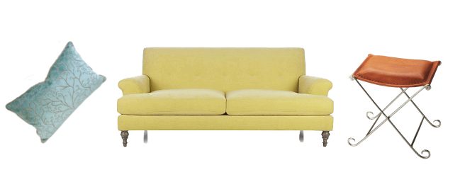
A few elements from the design board you will see near the end of this post
lemon yellow
melon orange
lime green
icy blue.
These colors sound like a popsicle tastes.
And look just as refreshing.
Why these colors?
It’s my one year anniversary since posting my first mood board —
a board that was inspired by the colors of spring.
So following tradition, and the turn of the season,
I wanted my anniversary board to be inspired by the colors of summer.
Now the process
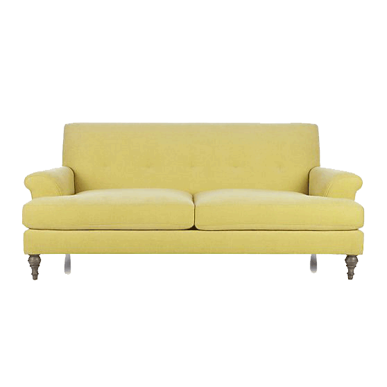
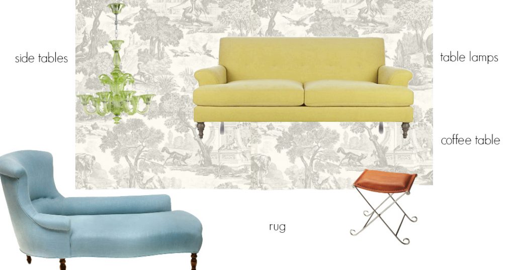
As in my last board, the design began with the couch.
crate and barrel
The color of this couch reminded me of the banana popsicles I loved as a child.
So, it seemed like a good jumping off point for a summer design.
Also, I love its traditional shape updated by the sleek, tight back.
Step two
The yellow velvet was so lovely I wanted a light, neutral background
to show it off against.
And for even more contrast,
I wanted the light, neutral background to be patterned.
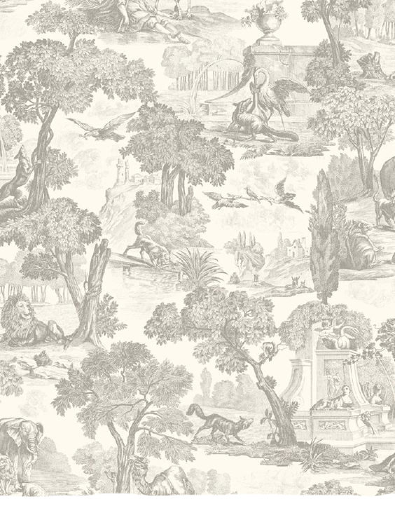
Cole and Sons Versailles
I chose toile for this assignment
because the traditional motif agrees with the traditional shape of the sofa–
thereby infusing the contrasts with an element of harmony.
Step three
From there I wanted to introduce more color.
I could have made the design monochromatic,
using only a variety of yellows,

or analogous…using only colors beside each other on the color wheel,

or primaries, adding blue and red to the yellow,

even secondaries, with green, purple or orange.

But I envisioned an even broader range than the secondaries,
and each blending harmoniously in with the yellow.
add image
With only a few, but wide-ranging colors in the design,
each becomes showcased like a jewel against the neutral backdrop,
creating an environ of simplicity, airiness, and updated classicism.
In addition, color selected from around the color wheel subtly increases the liveliness of the design.
The primary pieces of color
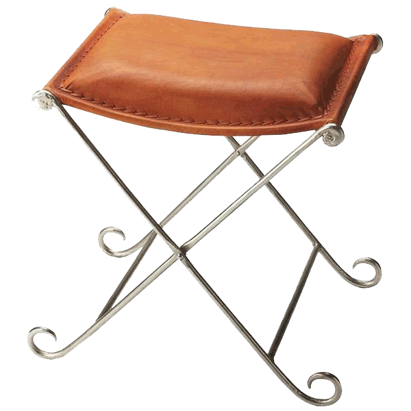
I immediately spotted this orange ottoman 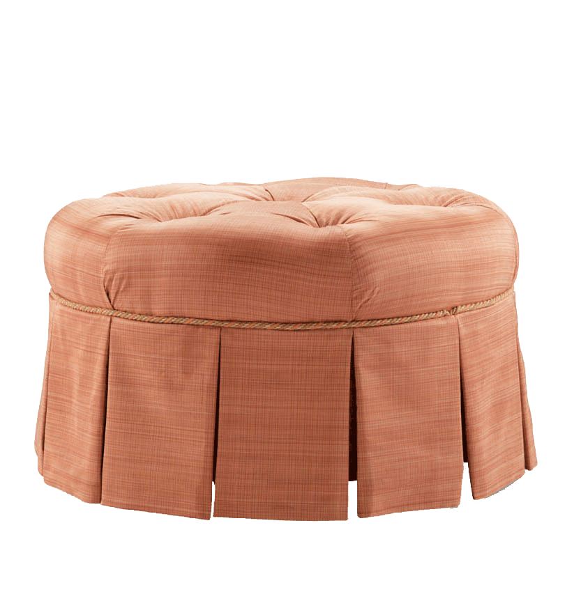
and saw how the soft orange could work with the yellow and threw it onto the board.
Though I loved its color and function as a stool,
the pleating and tufting seemed a bit heavy-handed for the sleek sofa.
I searched around for a replacement and found this stool.

Not only was the color right, but the shape was exactly what I imagined,
light and lyrical.
And as a bonus, the smooth, rectangular leather
was also better in the design than the striated fabric of the ottoman.
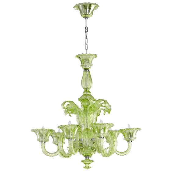
Then I espied the green chandelier…
and loved the lime as a match for the orange and yellow,
It had a traditional shape and exactly the right color, but would it, like the ottoman, prove to be heavy -handed?
I tried it, liked it and kept it provisionally–
knowing I might need to switch it out later, depending on what else developed in the design.
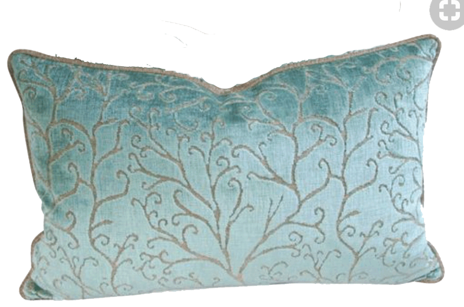
Now I needed a counterpoint to the warm tones and went in search of a blue.
This was more difficult,
but when I saw this light teal chaise, I knew I had found my blue.
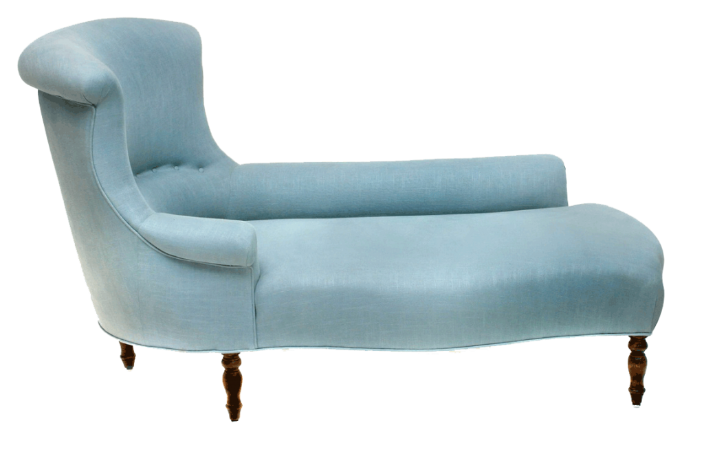
I tried it and liked it.
There was actually a popsicle of this exact blue that I ate as a kid.
I have no idea what the the flavour was, but it was eminently refreshing,
just as this pale, teal blue is beside the warm yellow and orange.
And again, the traditional but streamlined shape of the chaise fits perfectly into the design premise.
the supporting pieces
Having established the main idea of the design–
an airy, colourful sitting room playing on tradition and modernity,
I needed to find the secondary pieces to support this–
pieces that were beautiful in themselves but would not take the design into any new directions.
Here’s what I had so far with the missing pieces noted
to be continued……
I’m traveling in June so the conclusion of Summer Colors will appear at the end of the month.