Neutrals can take you just about anywhere
you want to go…
at home,
that is.
My last post covered the essentials of neutrals …
whether they are warm, cool, light, or dark, as well as their undertones and saturation levels.
Today, I discuss how to use neutrals and these attributes in interiors.
Two main ways
Basically, there are two main ways to use neutrals in interiors.
Neutrals as dominant
This means an all neutral or predominantly neutral interior.
and
Neutrals as support
This means an interior with anywhere from an equal balance of neutrals and color, to very little neutral.
In each case, though, the neutrals are significant;
even if there is very little, it is an important very little.
I’ll show you what I mean.
add image as an example
But today I am only going to discuss neutrals as dominant
Neutrals as dominant
This can be done in multiple ways. I’ll begin with the simplest yet most difficult of all.
a single value monochrome
Just like it says, this is where the space is a single neutral in one value.
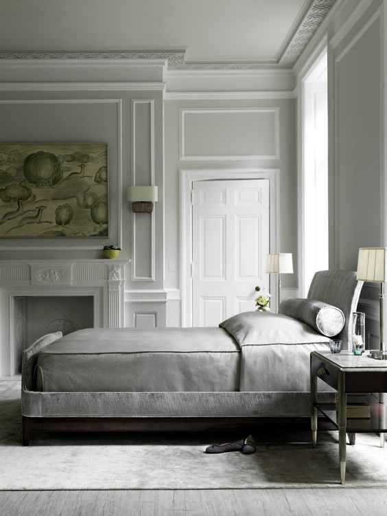
Phoebe Howard’s bedroom from my last post is a good example.
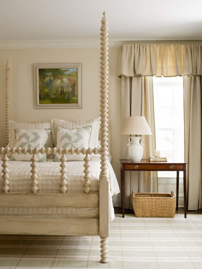
phoebe howard
There’s some dark wood, white and straw color to ease the palette but it’s pretty much one color, beige.
This approach can be austere but this bedroom is not that, due to the personality of the furnishings and the details mentioned above.
Besides which, beige can’t help but warm things up. Perfect for a bedroom.
I’m not saying any beige is perfect for a bedroom. We’ve all seen boring beige, but this beige, used this way, works.
Here’s Axel Vervoodt, the Dutch master of neutrals and wabi-sabi, doing the monochrome.
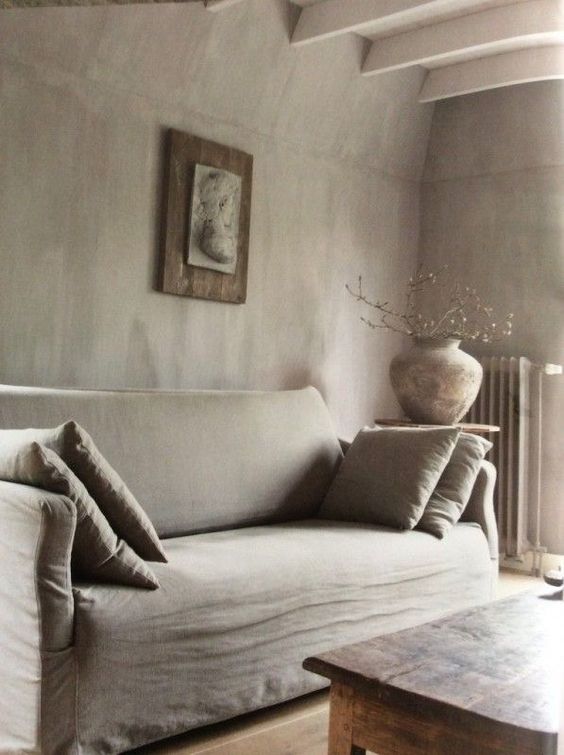
Now, this is austere
The paucity of furnishings, their simple lines and this bone-dry single tone creates an overwhelmingly monastic vibe.
Beautiful, in its way.
But not for me.
Reminds me too much of a prison cell.
Not that I’ve ever actually seen one.
The beams on the ceiling do offer relief from the otherwise smooth, flat surfaces.
But it’s not much;
even the branches in the vase look dead.
Compared to this, Phoebe Howard’s bedroom feels like a motherly hug.
But this room is monochrome and that is the point of showing it.
some subtle variations on monochrome
Not to get ahead of myself, but here’s Phoebe Howard again with a dining room in warm neutrals,
but this time she uses value contrasts.
It’s still all warm, but she adds dark and light elements– a dark beige wall with pale patterned chairs and a sisal coloured rug.
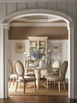
Phoebe Howard
Once you add varieties of light and dark, the field of possibilities opens way up.
Below is a neutral bedroom with contrasts of undertone.
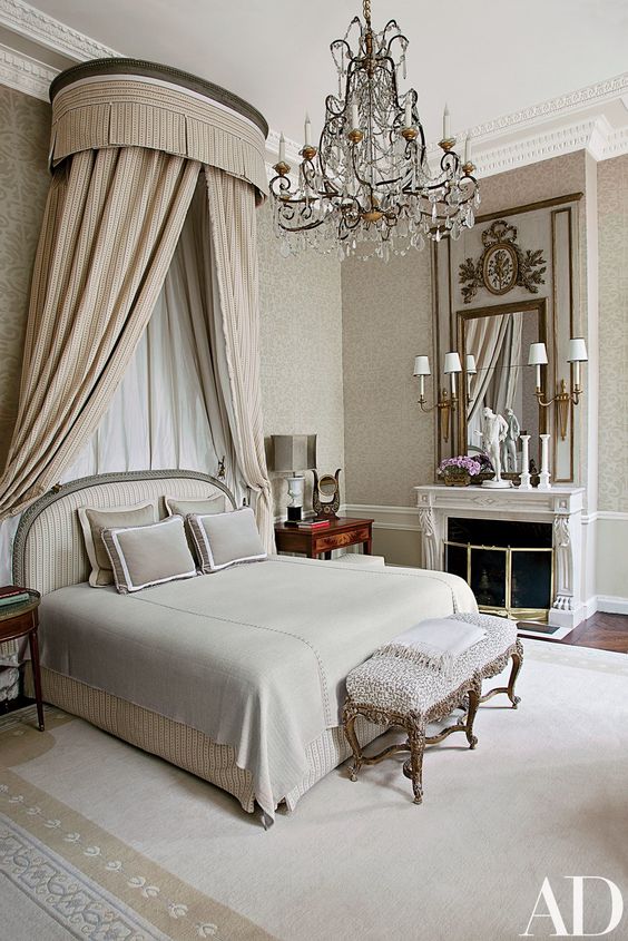 Jean-Louis Deniot via Architectural Digest.
This room is monochrome with subtle variations in undertone
and a few punctuations of light ( white sconces)
and dark ( side table and detail on the mirror).
The bed curtain is a beige, the wall greige, and the bedspread a cooler grey–
all slight undertone shifts retaining similar range of lightness or value.
Let’s get back to the single tone monochrome, without light and dark or undertone shifts.
Here’s a sitting room in a cool, grey monochrome, albeit broken up bit by some white and a few spots of a warm neutral.
It’s hard to find an exclusively monochrome interior. Or at least, a good one.
source?
Cool and contemporary but not as austere as the Veervoodt room.
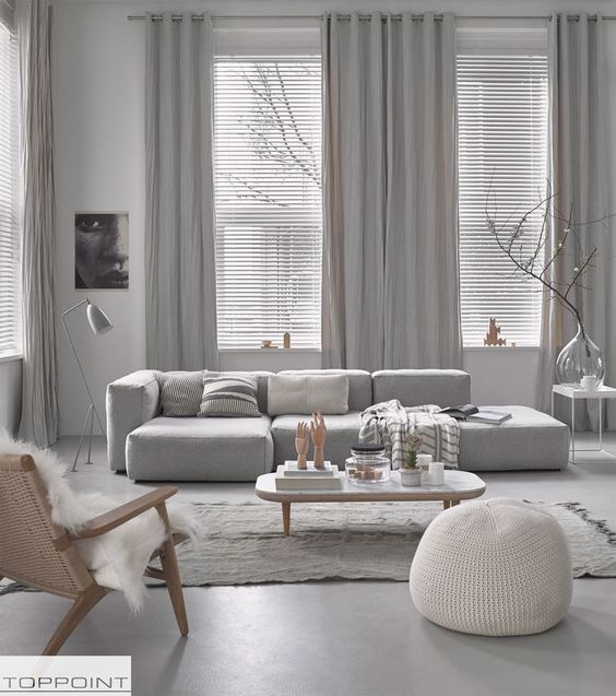
Here’s a monochrome grey bedroom with a few punctuations of warmth.
A monochrome interior done well can be very elegant.
Done well means with sensitivity to form (shape and composition of elements ) and subtle use of value or undertone contrasts.
On a side note, I often see texture suggested as a means to enliven a neutral interior but that I think can quickly become a cliche.
Best to think through what suits that particular environ rather than use a formula.
This, in fact, applies to any aspect of design.
My very own
I made this board as an exercise in composing in cool grey.
The chair is actually a warm grey but the overall impression is cool.
I mixed in a couple low contrast patterns for liveliness.
![]()
It’s not a complete idea but it gets the feeling across.
To further develop this space, I would introduce more contrast, as seen in the dark brackets and the white urns.
Personally, I prefer the vitality that contrasts provide in an interior.
But that’s just me. Someone else might prefer the subtly of an all monochrome palette.
I think it takes an intense, focused personality to pull off a monochrome interior because it requires a fierce amount of editing.
Now, I’ve just gotten started on neutrals as dominant
but that’s enough for today.
Next post will be about using contrasts.
Thank you for your visit.
I do appreciate my readers.
All twelve of you.
xo
Annie
.