Welcome!
I have another board today that contrasts with those I’ve done so far.
Any style’s a good style
When I see a thing I like,
I want to try it.
Not to copy,
though copying is fine,
even one of my most admired designers, Miles Redd, says so *,
but to understand the design,
the designer’s thinking and apply it in my own way.
I know, everybody is influenced, but I seem to be really easily led into new territory. I’ll figure that is a good thing. Unless you’re 15 and your friends are offering you drugs.
When it comes to interiors, I want to try my hand at everything.
So what am I trying my hand at here?
As the title proclaims, it’s crisp, it’s clean but what should I call it?
Preppy?
Coastal?
American?
I’m not sure if I can give a definition of any of those terms, and I’m not even sure where the original inspo for this design came from.
Wait……
Here’s an example of a blue and white interior that inspired my design.
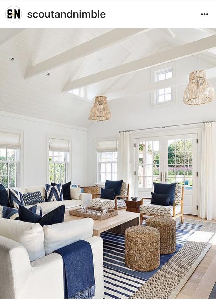 This is from scoutandnimble instagram but I do not know the original source or designer. If you know, please share.
There are many other examples; Mark Sikes is a genius at blue and white.
insert photo
William McClure has a gorgeous sitting room in blue and white.
insert photo
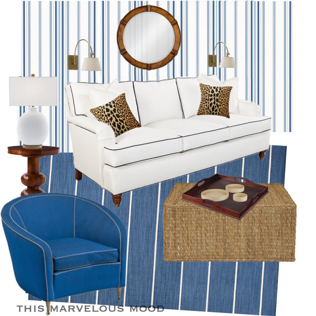
Here is my take on a blue and white sitting room.
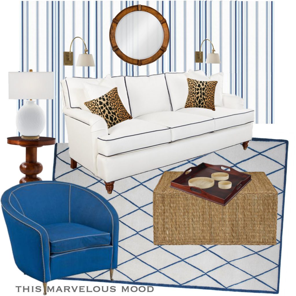
A dark wood floor would be gorgeous underfoot.
So what is preppy, coastal, American anyway?
I went off to do some research, thinking I should know, and came back not so much the wiser.
Some people showed pictures they called “preppy” that didn’t look much preppy to me.
Some people said it was pink and green, and navy and white stripes, and clubhouse but what is that?
I don’t mean to play dumb about clubhouse, but concrete description is what Im after, not more nomenclature.
Some were all about Dorothy Draper or Palm Beach style, which would include Lucy Pulitzer, as preppy.
Which could be a form of clubhouse.
With a big dollop of big glamour.
Or in other words,
banana leaf prints, chinoiserie, overblown everything,
and pink and green.
insert photos
Maybe I mean a more quiet, Ralph Lauren preppy.
Hah! there I go with my own code words.
Sigh.
As with more and more things in life, it seems I must rely on my own good sense to lead me out of confusion….
So here’s my (humble) take on preppy….
- clear, saturated colors yes, this can be pink and green or yellow or any color except maybe purple. Purple is weird. There’s nothing weird in preppy.
- classic, American shapes …The barrel chair might be breaching this rule, but it IS a clean blue, with contrasting piping. Extra points for piping.
- not a lot of knick knacks check
- pattern is okay ( like the chinoiserie bamboo wallpaper) but NOT texture. By texture I mean, to the hand, fuzzy or bumpy for example.
- nothing spooky, nothing old world check
Any definitions you’d add?
Subtract?
Coastal
This is easier to define. Blue and white, or maybe tan and white, or maybe all three, with some shells or rope or ink drawings of coral.
My design fits the color criteria without the seashore cues.
So, it’s sort of coastal.
American
This we could talk about all day.
So I won’t even begin.
Another post, another day.
Describing what I see
I taught art to children for several years and trained myself, by way of helping them,
to simply state what I saw.
Like playing I spy.
So, what I see here is….
A color palette limited to crisp white, saturated blue, and warm brown tones.
A lot of lines ….
And simple shapes…. rectangular and round, with NO FRILLS.
These simple shapes and the unpatterned upholstery, offer a quiet platform for all those lines to play against.
Which I think works together to create an interesting, cohesive design.
Which is the aim in any style of interior.
Liking what I see
Well, whatever it is, I like it.
And it came together pretty easily.
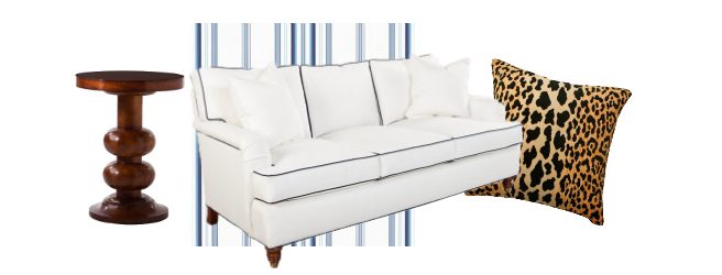
I already had the couch and chair already filed, as seating I wanted to work with,
and when I found the Ralph Lauren wallpaper,
I knew I had a match for them.
I needed a warm contrast to all that cool blue and white and so I tried the leopard print pillows and I was in love.
Then, by staying loyal to those first four elements: couch, chair, wallpaper and pillows, the rest followed easily.
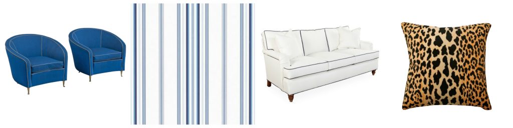
The only thing I might want to change is the rug,
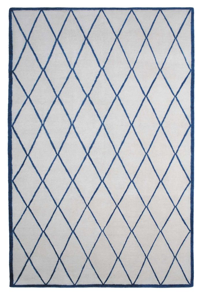
I think that’s because the white in the rug looks grey,
compared to the all the other whites on the board.
Probably a quirk of the photograph.
This is a possible replacement but it has a lot of stripes in an already stripey atmosphere.
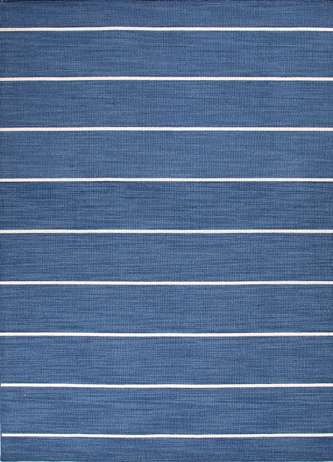
But let’s try it and see.
The darker rug really pops out the white couch, similar to the leopard pillow’s.
Not bad.
The wide, calm spacing between the stripes on the rug contrasts nicely with the jittery stripes on the wallpaper.
What do you think? Striped rug or diamond pattern rug?
Overall, the freshness of this design appeals to me and
I love the warm, dark contrasts of the pillows and side table, etc
to the crisp white and blues.
Out of season
I call this out of season because with November here,
my inner designer turns towards the warm colors of fall,
but I’ve had this board lying about since last spring and I want it published.
I am sitting on a mountain of design boards,
which feels uncharitable.
Like hoarded and sequestered children.
Let them run free!
End the abuse!
Anyway, some people say blue and white are never out of season.
Tell me what you think,
I’m especially interested in your description of preppy.
Because a gal needs help.
And as always,
thank you for your visit!

Annie, I’m enjoying your blog immensely. You have so many inspirational ideas.
My vote goes for the striped rug! Lisa
Immensely?
Did you say immensely?
Thank you, Lisa!
You just made my day!
I think I like the striped rug better, too.
I like how it grounds the space and highlights the white sofa.
Hei Ann. Så fin blogg du har! Mye vakkert å se på! Klem fra Kirsten
Tusen hjertelig, Kirsten.
Det var koselig av deg å stikke innom!