Hi Friends and Welcome back!
Today I have something a little different to show you.
We’ve all seen contemporary interiors designed in neutrals, some of them very beautifully, and I was intrigued by the idea of designing one myself. I usually prefer some pattern or color in a room but the challenge of designing an interior composed entirely of neutral tones and minimal lines interests me, without the space becoming dull, which, let’s face it, can happen when working with a limited palette.
So, I have decided to design a simple and practical entryway in a neutral palette.
THE PROCESS
I am fascinated when others share their design process with me, so now it’s my turn to share with you.
Establish Context
The first step in my design process is establishing context. This includes the intended use of the space, the style and colouring. In the real world budget would be included here but since this is my fantasy we can throw that out the window. Throws up sash, sound of crashing ensues. Actually, I’m skipping a lot of things important in the real world, but never mind that.
So, the intended use for this design is a simple entry, say, for a city apartment, the style is minimal, contemporary and the colouring neutral. Done.
Select Components
Now I begin selecting the individual components. If this design were for a real person and they had a piece of furniture or artwork that had to be included, I would begin there. But there’s no client here so I can begin anywhere I want to. Hah!
I like a console in an entry so I will begin there.
A Console
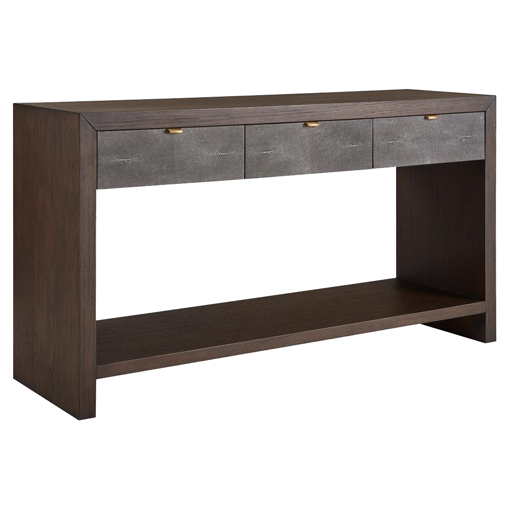
Kathy Kuo Home
This drew by its handsome proportions and minimal lines. A faux shagreen surface adds texture and drawers and multiple levels provide storage, which is me being practical.
Next…
A Chair
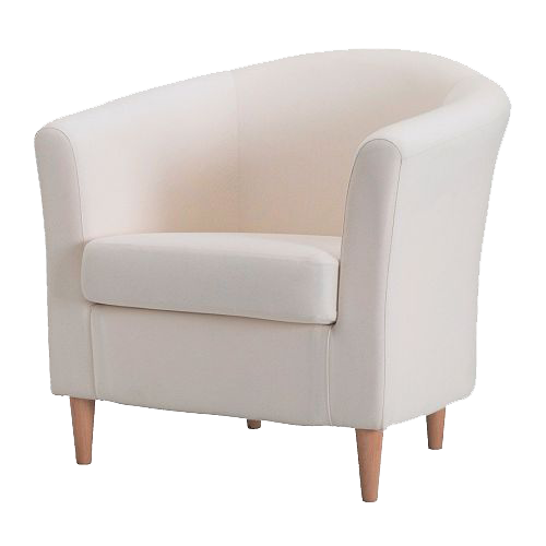
Ikea
A chair in an entry is usually a good idea, and I love the sleekness of this smooth white cloud TULLSTA armchair from Ikea. I can’t speak for the quality of its fabric or construction but it looks delish on the screen!
But if you don’t approve of the fabric there’s always this…..
Fabric
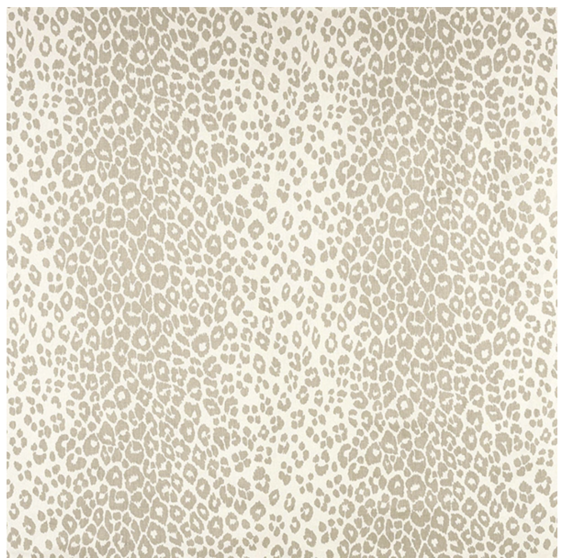
Schumacher Iconic Leopard
This would work for curtains, if there’s a window nearby, or a pillow or upholstery; the Ikea chair would be beautiful covered in this and a little pattern in a contemporary interior doesn’t hurt one bit.
Another Chair Option
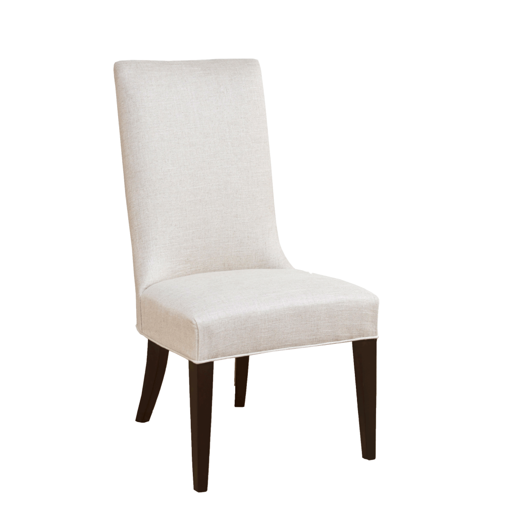
Alden Parkes
I fell for the Ikea chair at first sight but this one would work even better if space is limited – it’s both narrower, and less deep than the Ikea chair and the linen fabric looks fine.
Thus One Becomes Two
I will make two boards, then, one for each of these chairs. The rectangular chair might work better with the console than the roundish Ikea chair but we’ll know better when we see the boards.
Before we get to the boards, a few more things to show you…
The Rug
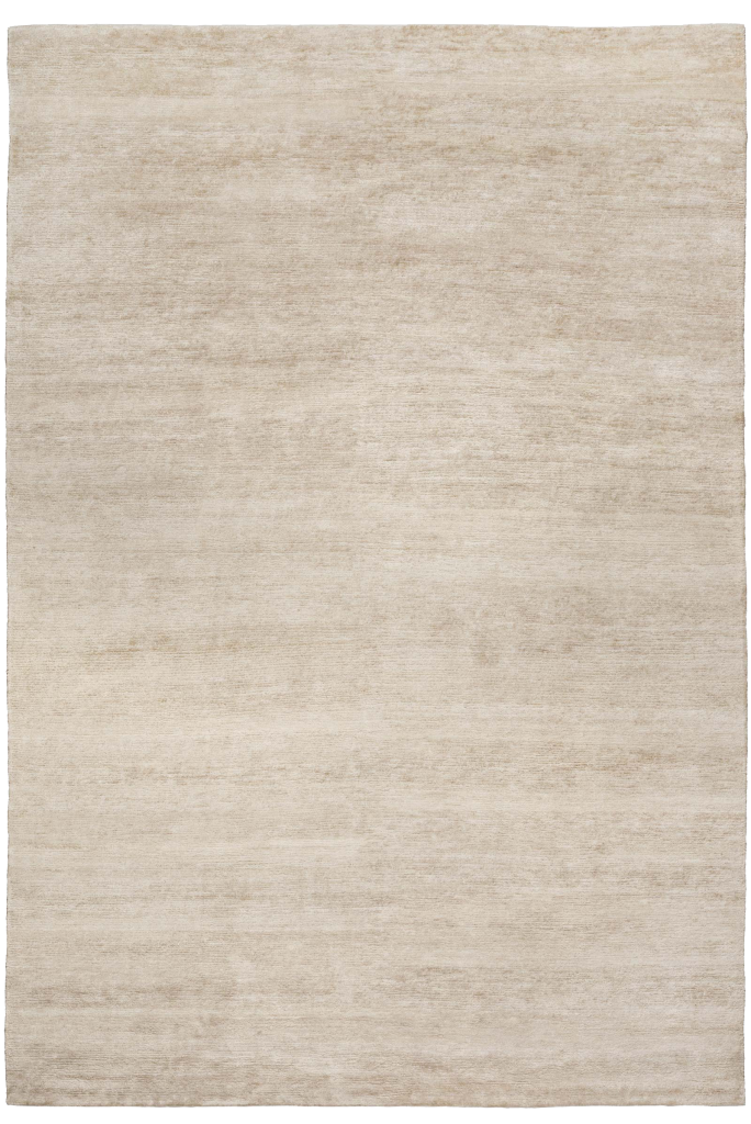
The Rug Company
The subtle texture and soft color of this silk bamboo rug suit our design criteria to the T.
Now to view all this gorgeousness we need…
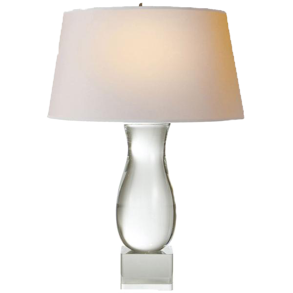
Lamps
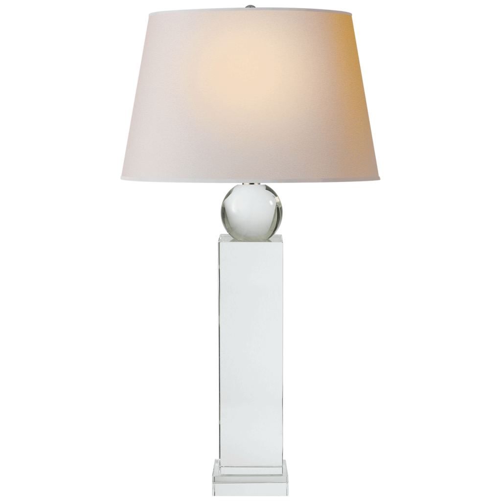
Visual Comfort
Or lamp.
But there will be two in the final board.
I chose this because it has both rectilinear and round components. Why is this a good idea? Because those shapes will act as a bridge between the rectilinear console and the round mirror, which is coming up next.
The Mirror
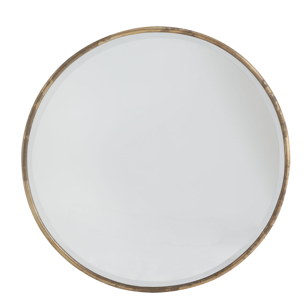
Wisteria
Why this mirror? Because it is round and simple, which fulfils the minimalist criteria while providing shape contrast to the rectilinear console.
Now that we can see, we can dress the walls with…
Art
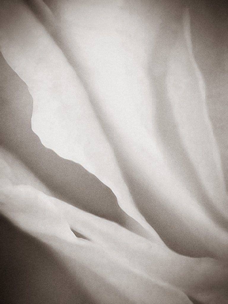
Moises Esquenazi
This image’s softness works with the Ikea chair and its tones span the dark of the console to the light of the chair.
And finally we can …
Add Accessories
A vase
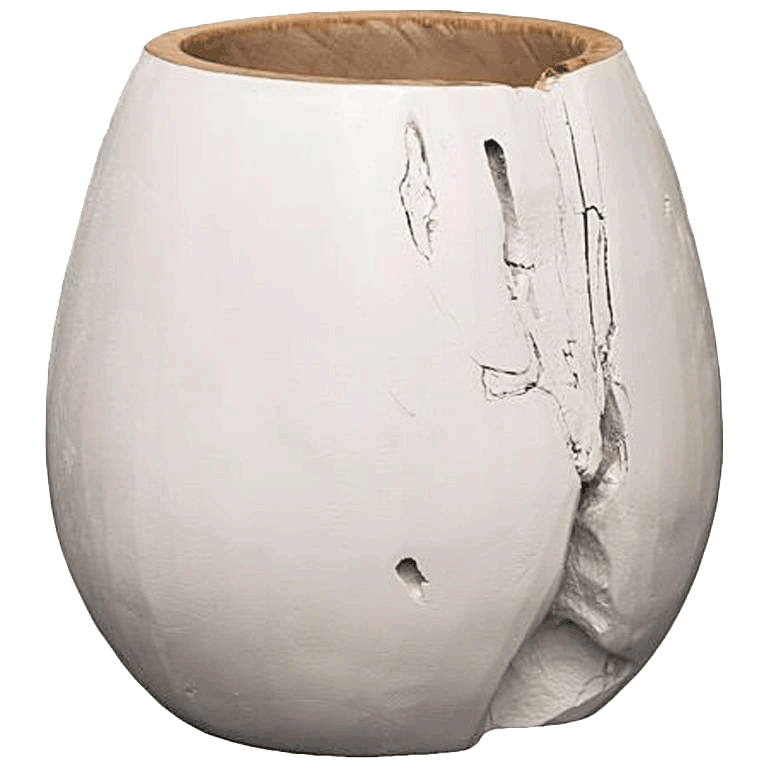
1stdibs
I like this vase because it is soft and and white and has those little crinkles that remind me of the shapes in the artwork.
Some Other Bowls
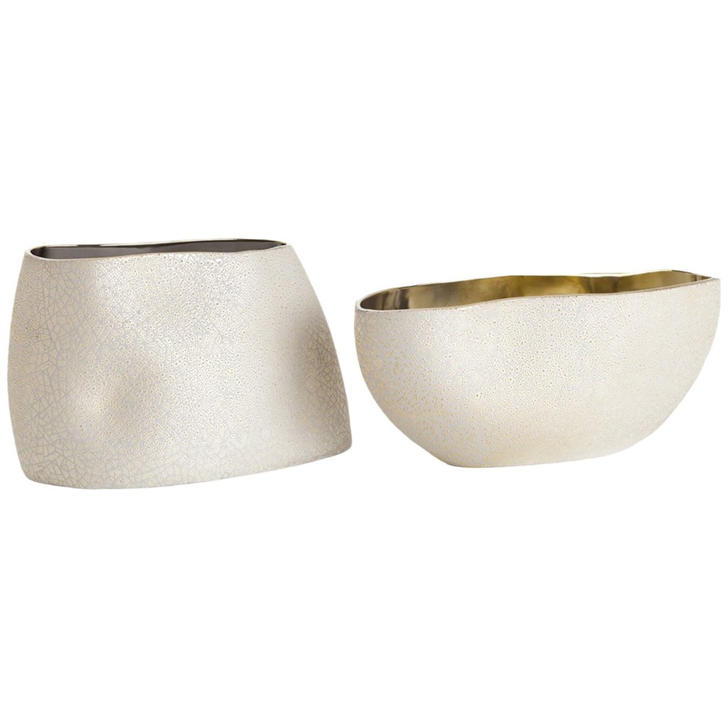
Arteriors
These bowls would be nice on top of the console for holding keys, plants or just for prettiness´sake. They are gold lined so maybe a little glam/ bright for the greige theme but their shapes and surface work beautifully.
A Decorative Doo Dad
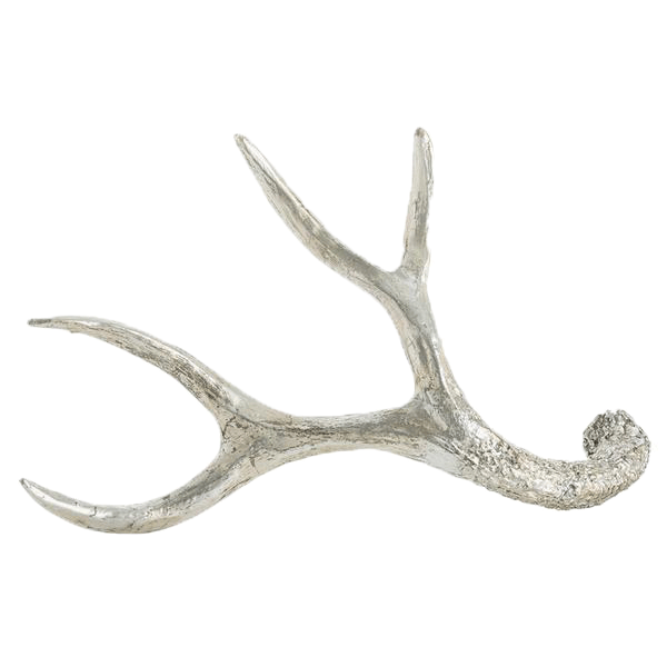
Stephanie Cohen
These antlers provide no obvious function beyond being a shape, but you could dangle your keys on them.
Finally, the boards …
Wait.
One more thing.
I found a lamp I think will look better with the Ikea chair. (The first lamp I showed you will show up on the second board. Complicated.)
A Better Lamp for the Ikea Chair
Visual Comfort via Stephanie Cohen
Putting It All Together
With all the components selected, we can put them together.
A Contemporary Entry 1
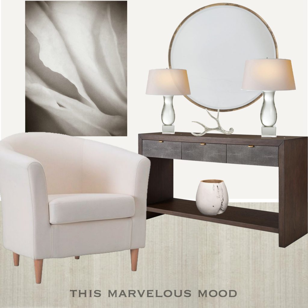
I like this design’s play between soft and hard and dark and light. There are strong value contrasts but they are still neutral.
Now we can check out the second arrangement with the rectilinear components.
A Contemporary Entry 2
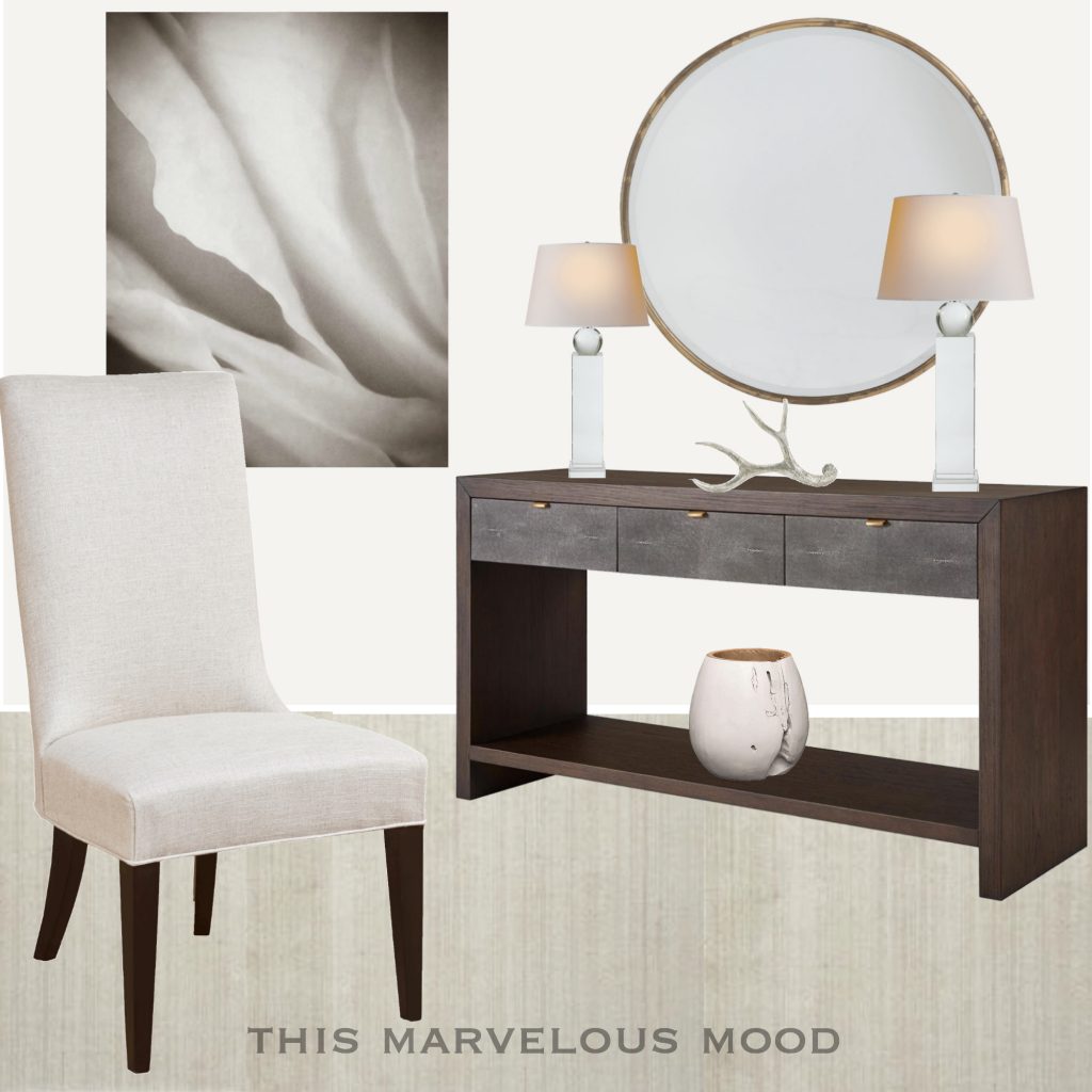
This design has a whole different feel to me – more sleek, maybe a little stiff, definitely more masculine. And all I changed were the lamps and the chair.
A New Idea!
Now I´m curious to see what happens if we go even sleeker and add some curves back in.
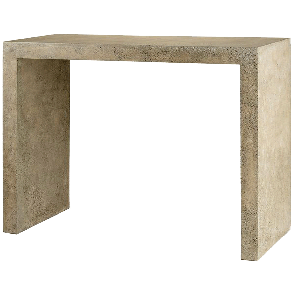
A Harewood Polished Concrete Console
Currey and Co at Stephanie Cohen
You say you want to go sleeker and you pick concrete? Yes, that’s what I did. But I love the lines and color of this console, and even though it weighs a ton and we lose the drawers, it is visually sleeker than the Kathy Kuo table.
However, changing the console means we’ll need to make some other changes as well.
Art Work Change
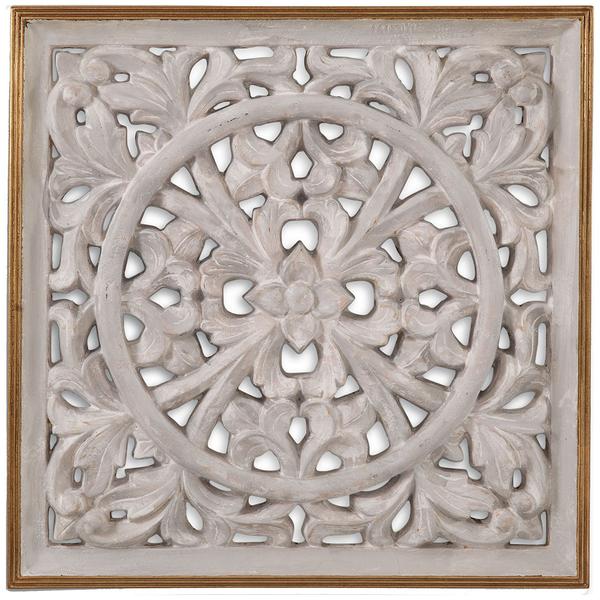
Basset Mirror Wall Medallion at Stephanie Cohen
I’m excited by what magic could happen between this plaque and the ultra-simple console.
Accessory Change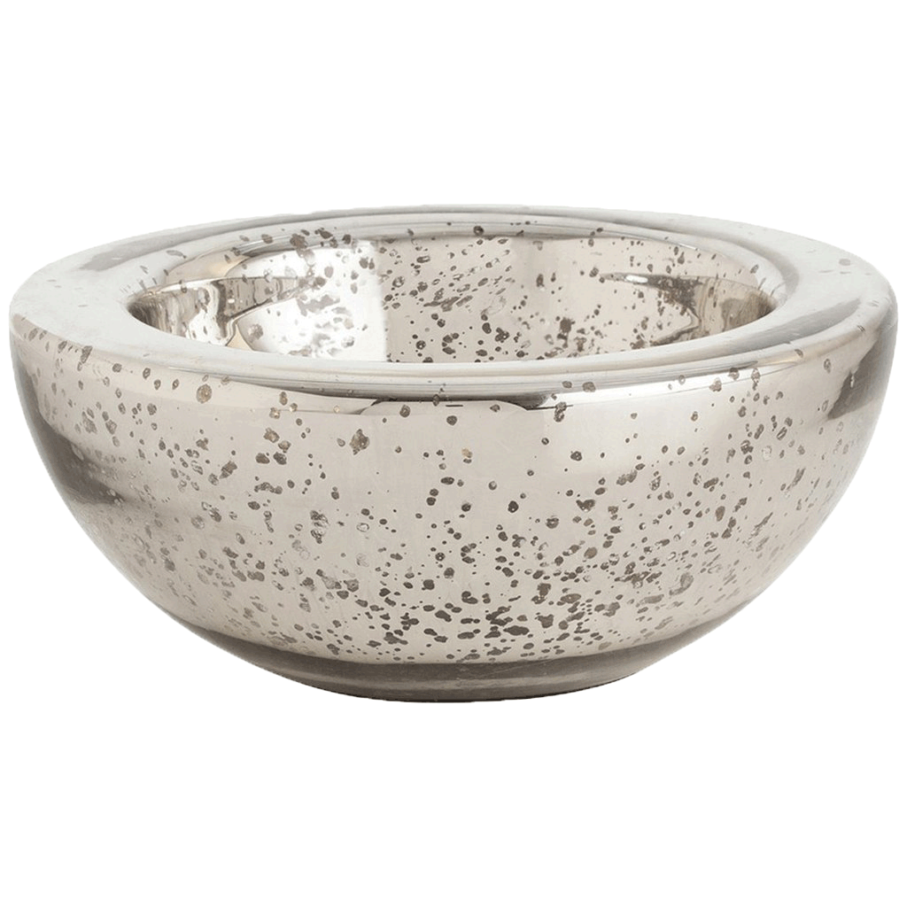
Stephanie Cohen mercury bowl
Without drawers or a shelf we really need something to function as a holder and the solid simplicity of this bowl will sit well on the console.
Now to see it all together
A Contemporary Entry 3
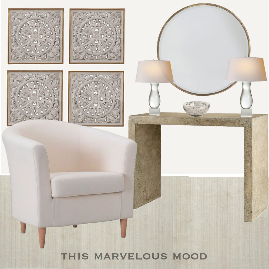
Besides being sleeker and softer, I like how subtly colourful this has become. I miss having drawers in the console, but on the upside, a small bench or ottoman could be tucked underneath for extra seating. The glass bowl can hold keys, receipts, etc. or you could put a glass tray in that spot as a catchall. I love the contrast between the wall plaques and console and how the lamps and chair soften the console’s sharp lines.
Summary
An entry seemed like an easy first step into this, new for me, contemporary, minimal style and so it was. An entry’s requirements are few — a mirror to check yourself in, some light, a surface for setting your bag on, a chair if possible and art for the soul.
But even with these few elements, I could go on forever exploring the possibilities.
Don’t worry. I’m not going to!
As I mentioned, all this departs from my usual preference for pattern or color, but it is also my preference to try a bit of everything, so I guess this contemporary greige-ish-ness makes as much sense as anything else I do.
In my next post I am going to abandon these neutrals and throw it all in for color and pattern so, STAND BACK!

SaveSave