Yup.
And I’m being slow about it, too.
I caught heck from myself for not posting in December and now it’s the end of January.
It’s much easier for me to design than write and so design I do.
And then remind myself to write and say oh, yeah, later today and then later today I am reading someone else’s blog or petting the cat.
Once I begin writing, I enjoy it, which is why I began this blog in the first place, as well as to clarify my ideas about design and of course, share them with you.
But back to neutrals.
Last time, I discussed single value, neutral interiors.
Today I’m taking on neutral interiors with contrasts; light and dark value contrasts as well as warm and cool tones.
My intent is to lay before you what an exciting range of possibilities there are with neutrals.
We should never think, “Oh, neutrals” ,
with a voice like eeyore–
but rather,
NeulTraLS!” Let me at ’em!
I’ll begin by showing an interior with the full range of contrasts mentioned above…
NEUTRALS WITH LIGHT AND DARK AND WARM AND COOL
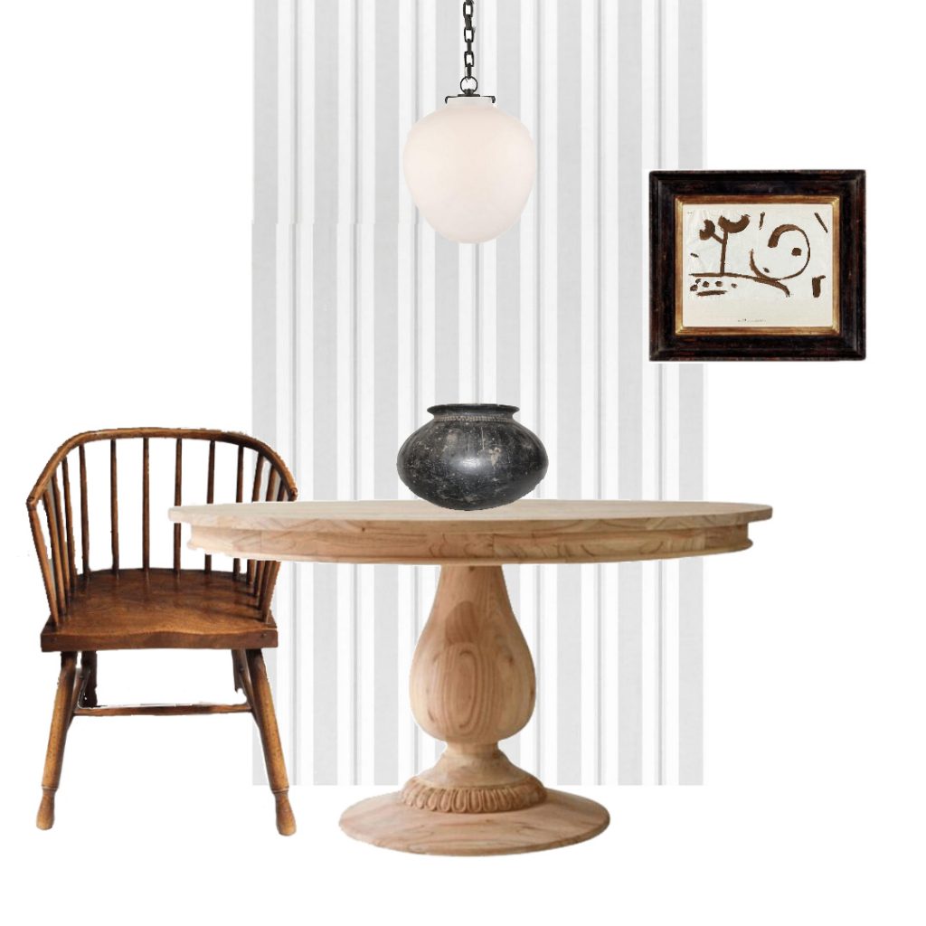
This is the most minimal design board I ever made. It’s a simple, neutral interior that incorporates both light and dark and warm and cool elements.
Light
- pale grey and white striped wallpaper
- natural wood pedestal table
- pendant lamp
- background in the artwork.
Dark
- african bowl
- frame around artwork
- Windsor chair
Warm
- windsor chair
- pedestal table
- lines in artwork
Cool
- wallpaper
- ceramic bowl
All of that’s pretty obvious but sometimes I like my information spoon fed to me so I’m happy to spoon feed you.
Scoot in a little closer….
Let’s see if I can find a neutral interior using all dark with only warm and cool contrasts….
ALL DARK NEUTRAL WITH WARM AND COOL
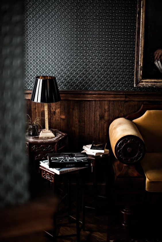
Abigail Ahrens is famous for her dark interiors so it’s not surprising that I found my dark neutral amongst her work. Notice how the sofa and wall contrasts with the cool wall paper and black lampshade. Overall very warm with the added interest of contrast.
Now for my next trick….
ALL LIGHT NEUTRAL WITH WARM AND COOL
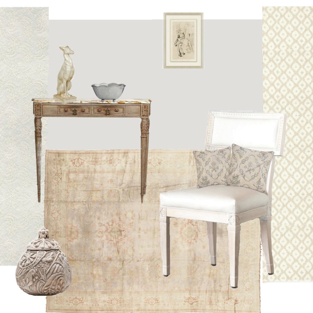
My search didn’t turn up a clear example, so I made my own…. a light, neutral interior with a range of warm and cool tones. What always amazes me is how colourful a sensitively composed neutral interior can be; each of the elements in this room viewed independently would be considered neutral, but when set beside each other, they draw out the color in one other and behave like pastels.
The table, for example, comes across as a dark element. If this same table were placed in Abigail Ahrens’ vignette it would appear light. More of that fancy, simultaneous contrast.
Now we have seen both a dark interior with warm and cool contrast, and a light one.
What’s next ? ? ?
Come on class….
……..an all warm room and then an all cool room with light and dark contrasts.
Are you keeping this straight?
I’ll do a review at the end to sum it up.
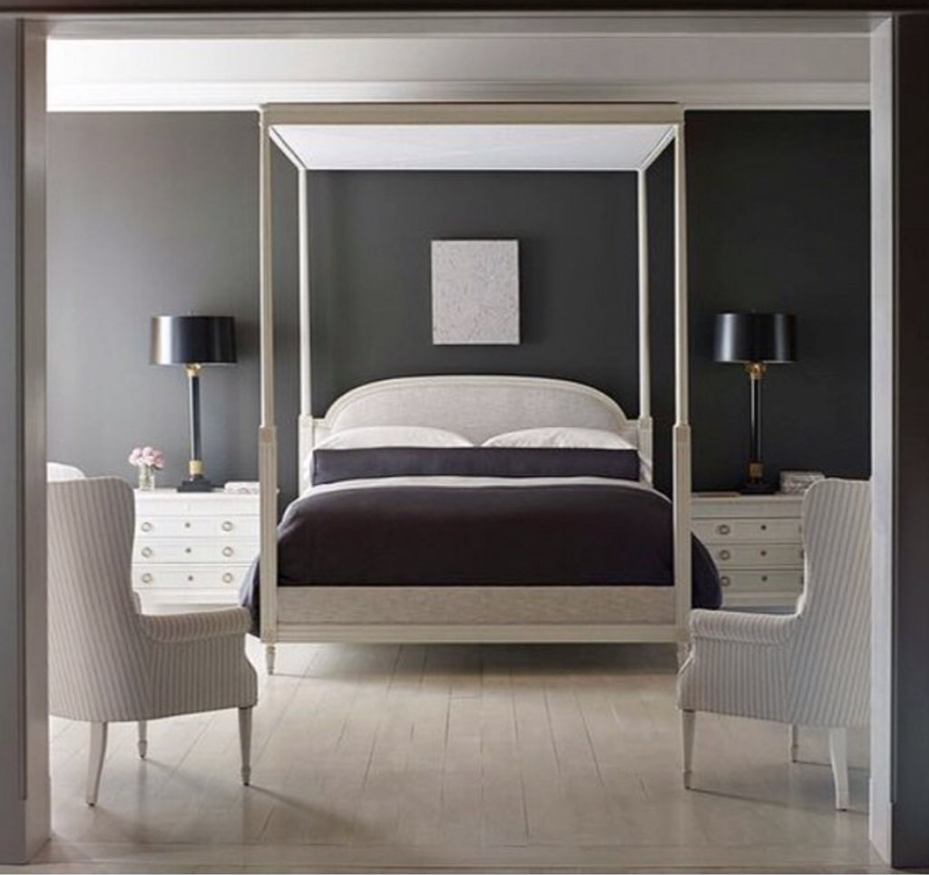
ALL WARM NEUTRAL WITH LIGHT AND DARK
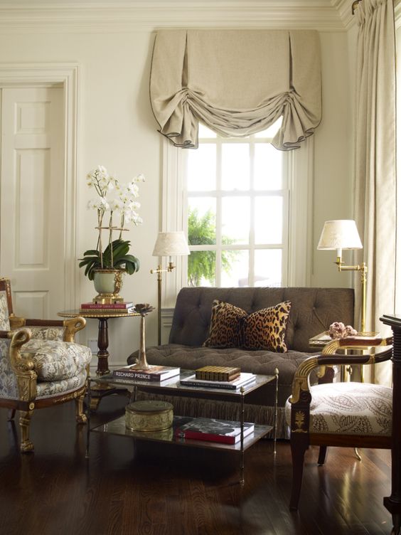
Alex Pappachristidis is one of my favourite designers. His rooms are always elegant and thoughtful.
And another one…

This is Mark Sikes’ gorgeous room in warm neutrals for The Southern Living Showhouse 2016. It’s a little cooler overall than the Pappachristidis above but still on the warm scale. I do notice two illustrations of ducks that are in cool tones but apart from that.
Now on to the cool neutrals….
ALL COOL NEUTRAL WITH LIGHT AND DARK
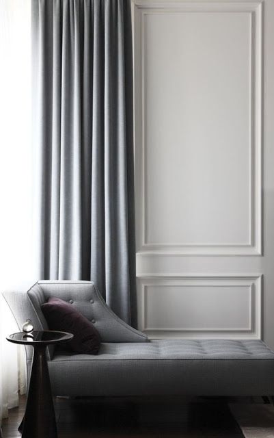

It was harder to find an all cool interior that I liked. I suppose because it’s harder to do well. And of these three, not one is entirely cool. For example, this last room above has walls that are more griege than full on grey but again, the overall effect is cool rather than warm, or certainly way cooler than either of the two warm examples I showed before.
I made a board of my own to see if I could pull off an entirely, unreservedly cool interior.

This is seriously cooler ( in temperature) than any of the rooms above. Also, the aesthetic is softer. Whereas those above are minimalist and streamlined, I used patterns, curved shapes and a loose composition to create a bohemian, romantic style, to see if that could warm the atmosphere. I think it helps but it’s still chilly for my taste.
WARM AND COOL NEUTRALS OF EQUAL VALUE


REVIEW
Again, the point of these posts is to illustrate the great range of possibilities available with neutrals.
Last post I discussed monochrome neutral interiors, both warm and cool
and today I discussed these variations of neutrals:
- the full range of light and dark and warm and cool
- only dark with warm and cool
- only light with warm and cool
- only warm with light and dark
- only cool with light and dark
- and finally, I showed images with warm and cool neutrals of equal value
That’s a whole lot of neutrals and I am not finished with the subject.
Next time I’ll talk about neutrals with color…first with a little bit of color and then moving on to a whole lot of of it.
I know this is a little obsessive but a gals got to do…
Thank you for stopping by!
xo
Annie