Tain’t what you do
but the way that you do it.
I love neutrals.
I might be late to this party
as neutrals have been popular for a long time
and their trend has peaked
and maybe lavender is now where it’s at
but good design is not dependant upon any particular color
and anyway,
I gotta be me.
Greys were the star for many years,
while beige has been unloved, though that is now changing,
but my heart is open to all neutrals, all the time–
their whole spectrum enthrals me.
Like a mother awed by the endless potential in each of her children.
So, what began as a brief musing on neutrals
turned into hours of research, multiple drafts,
a lapse between posting and finally, the decision to
give passion its due and take this subject on as a series.
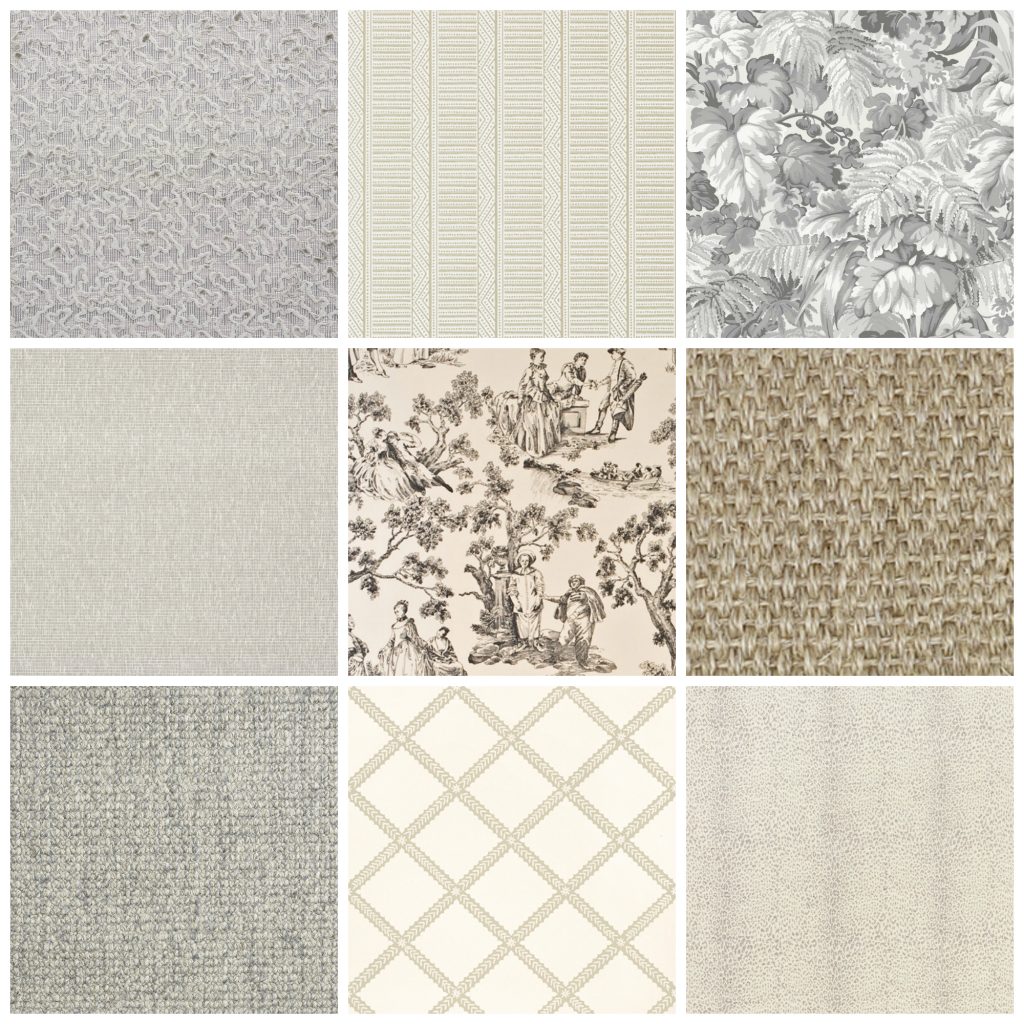
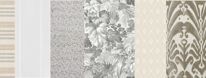
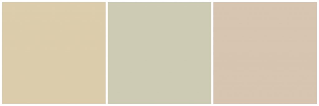
A collage of pretty neutrals
I’m doing this for my own understanding
but hopefully,
truly hopefully,
this will refresh, revive, and rekindle your passion for neutrals, as well,
thereby elevating all of us to the level of super neural, neutral designers.
So, here’s post one.
This will cover the basics.
The next post will be about using neutrals in interiors,
and what comes after that, we shall see.
When I want to get a grip on a subject, I go elementary;
with basics in hand I have a framework for the details when I go deeper.
Consider the above a warning that the rest of this post is going to be at grade school level.
Warmth and Coolness
The first thing I want to talk about is neutrals’ relative
warmth and coolness.
(To keep things simple, all paint colors are Benjamin Moore.)
Beige
A warm neutral is usually called beige
or tan,
and if its really light,
cream.
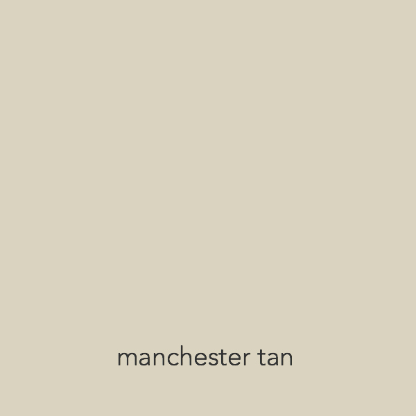
Manchester Tan is a nice, medium beige.
Grey
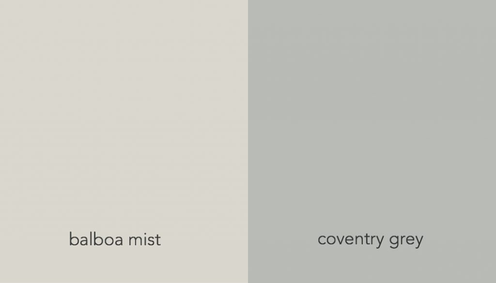
A cool neutral is grey. Not so many other names for grey.
Just grey.
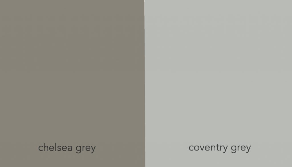
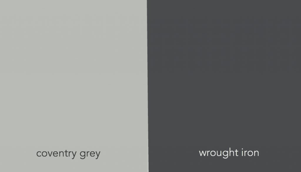
Coventry is a grey that pops up often on “best grey” lists.

So far, so good.
Beige is warm.
Grey is cool.
But there are cool beiges.
Relatively speaking.
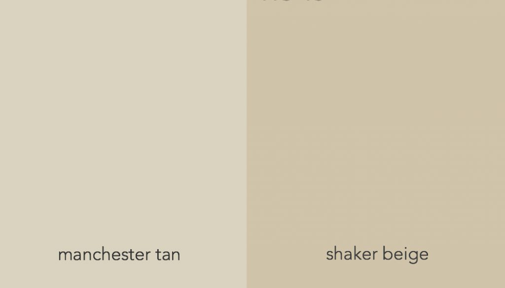
Manchester Tan next to Shaker beige looks cool.
And warm greys.
Chelsea grey next to coventry grey looks warm.
Griege
Then there are those neutrals that we can’t quite put our finger on…..
they look cool next to beige but warm next to grey.
These are usually called greige.
Grey + beige = greige.
Sometimes taupe.
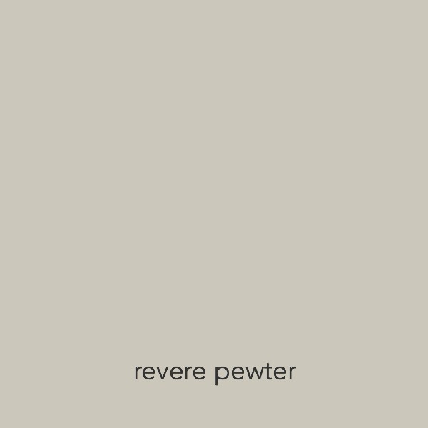
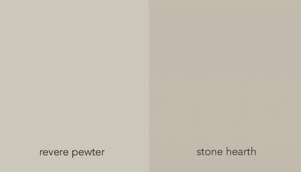
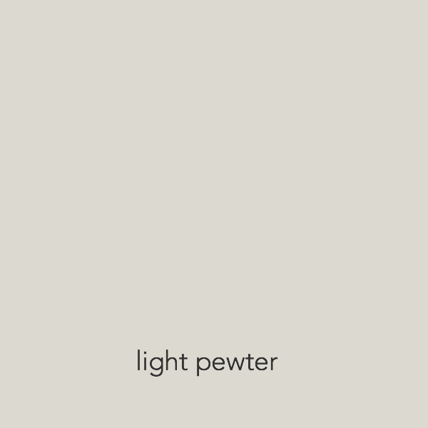
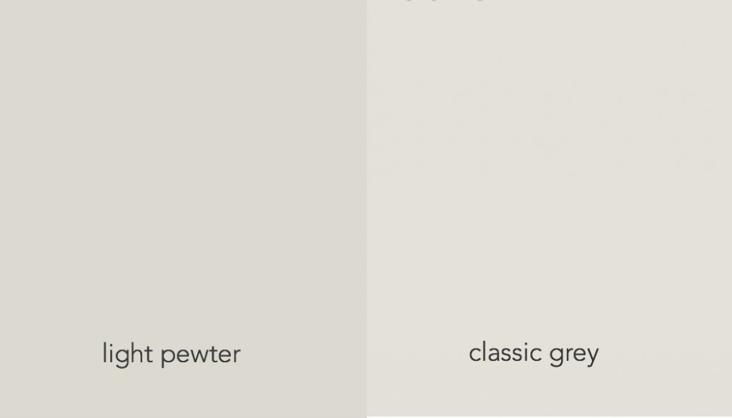
Revere Pewter is a popular greige.
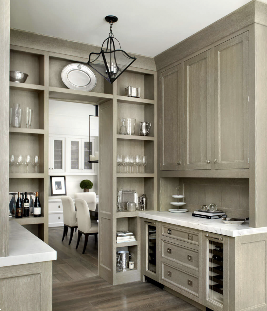
A beautiful pantry in greige by O’BRIENHARRIS
Just as with grey and beige,
greige can also be relatively warm or cool.
Besides being lighter, Balboa Mist looks cool next to the Revere Pewter.
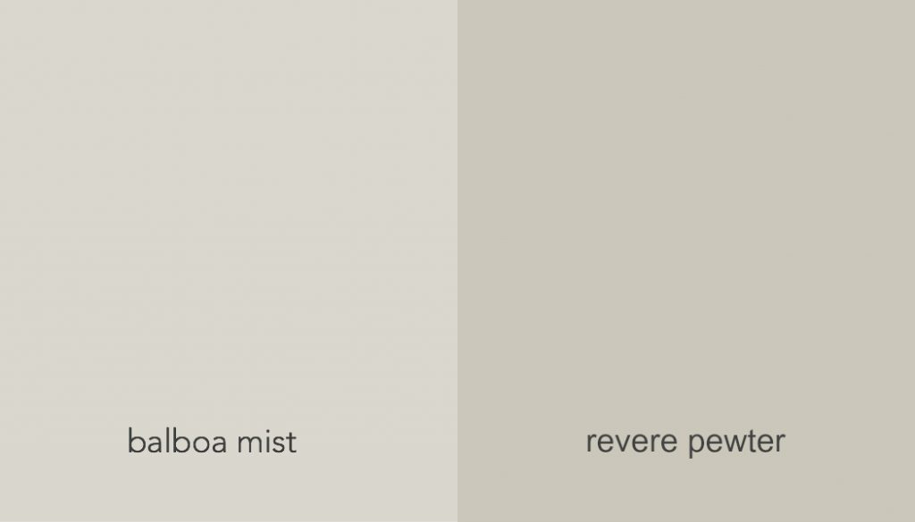
And Revere Pewter looks cool next to Stone Hearth.
But greige will usually ( always?) look warm next to grey
and cool next to beige.
This change in appearance,
depending upon what color any other color is next to,
is due to an effect called simultaneous contrast,
a phenomena first investigated by the French chemist, Michel Eugène Chevrel
who wrote a book on it called
“The Principle of Harmony and Contrast of Colors,” in 1839.
Just so you know.
Is one neutral better than the other ?
Some say greige is more sophisticated than beige but it really depends on how it is used.
Phoebe Howard created this charming bedroom using a single tone of beige.
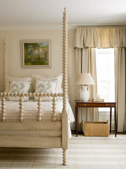
Phoebe Howard
Looks like Manchester Tan.
Serene, sophisticated and homey, thanks to the four-poster, spindle bed, plaid rug and flounced valance.
Same with grey.
Jean Louis Denoit uses tons of grey and his interiors are paradigms of sophistication.
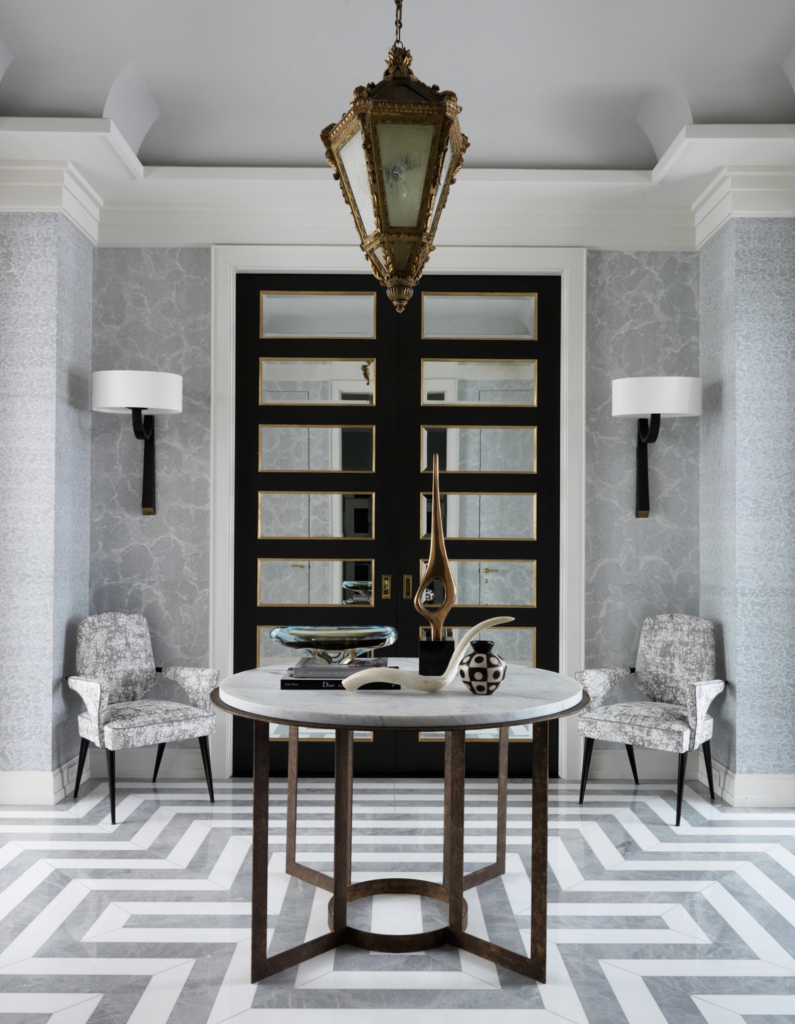
Jean Lousi Denoit 5th Avenue entry hall
So, as the song goes,
Tain’t what you do but the way that you do it.
If you click that it will take you to Ella Fitzgerald, but please don’t do that ’til you finish reading.
Thanks.
Light and dark
The next quality of neutrals is
lightness and darkness.
Sometimes referred to as Value.
This one’s easy.
We all recognise what’s light and what’s dark.
Where it gets interesting is that
something light, seen in isolation,
can look dark next to something lighter.
Another effect of simultaneous contrast.
And important to be aware of when placing neutrals together.
Undertones and Saturation
Two big words at once.
Il’l define each, then break down their roles.
Undertone describes what color is in the neutral.
(This can also be called hue—
hue, color, undertone, all mean about the same thing.
Undertone indicates that it is a color within the neutral. )
Saturation is how much of that hue, color, undertone is in the neutral.
more about undertone
This is where it get tricky.
Neutrals by their very nature are low saturation,
meaning they have little color in them (which is why they are called neutrals)
and modern chemistry can slice these undertones up
into infinitesimal amounts, proportions and combinations,
making it infuriatingly difficult to nail down what just undertones are present.
Why does it matter?
It matters because creating beautiful color relationships requires being able to see the differences in undertones.
Let me repeat that because the crux of working with neutrals hinges on that one idea.
Creating beautiful color relationships requires seeing the differences in undertones.
But maybe you already knew that.
Maria Killam at Color Me Happy
has a color system devoted entirely to this subject.
I refer you to her for all your undertone questions as I make no claim to expertise.
I’m pretty good but she’s probably better.
I am sort of an explorer. Like Mssr. Chevrel, whom we met previously.
But we can begin with the basics,
again.
the beige undertones
According to Maria Killam, beige has 3 undertones: yellow, green or pink.
(You could say red instead of pink,
because pink is made of red and red is the primary color
but so what, we’ll use her terminology.)
Below are three beiges in each of the undertones.
yellow green pink
 Powell Buff Moon Shadow Boudoir
These are saturated with undertone, making it easy to see their differences.
Note all the beige undertones have a warm color in them which is why they tend to warmth.
the grey undertones
Grey, also, has three undertones, according to Maria Killum:
blue, green, and violet.
Below are three greys in the three undertones.
blue green violet
 Silver Lake Cliffside Gray Cement Grey
These less saturated greys show how subtle the undertones can become.
Note that all of the undertones in grey have some amount of blue in them,
which is what makes them tend toward coolness.
more about saturation
Again, this refers to how much of the undertone is present in the neutral.
As I mentioned above, neutrals by their nature are low in saturation, but they do vary.
There can be little,
or there can be a lot,
in which case the color can begin to leave the realm of neutrals and join the family of straight up color.
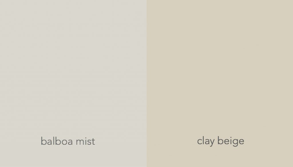
Brush Beige looks nearly brown next to Clay Beige
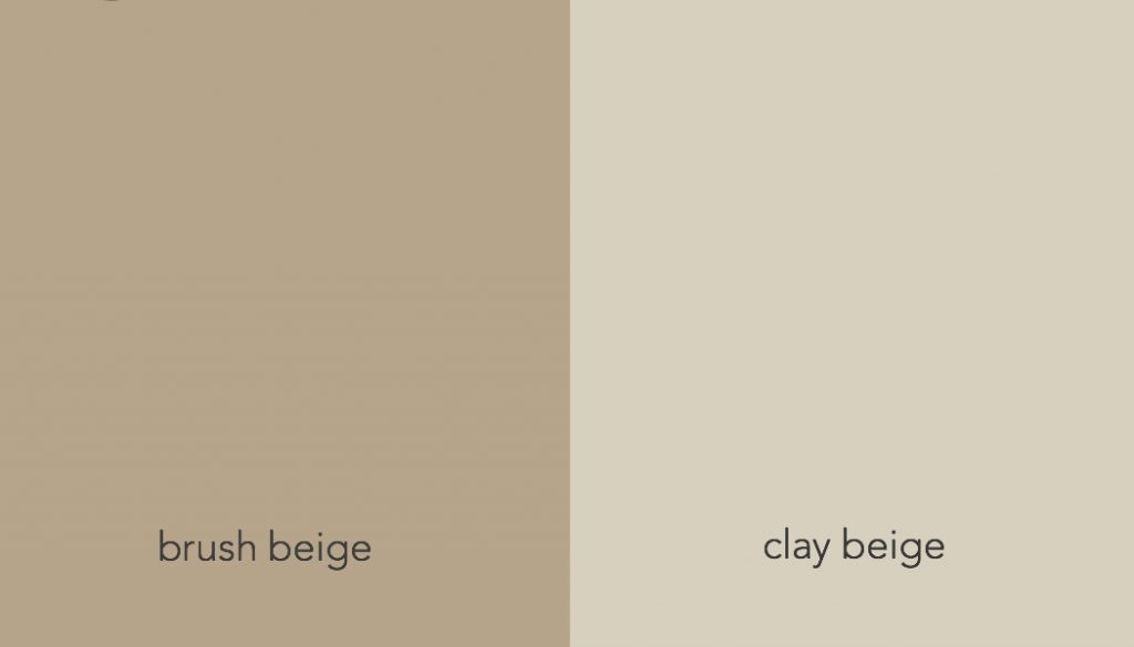
but next to a real brown, like Maryville, Brush Beige becomes a neutral again.
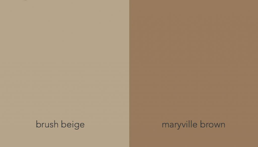
It’s all relative. Always.
Practice
It takes a keen eye to work with these slippery neutrals
and that keen eye develops through training.
Let’s practice now while we are warm to the subject.
I spy
This fabric below is composed of four different neutrals.
I’ll describe each as I see it.
You might see them differently and you might be right and I might be wrong,
but someone’s got to get the ball rolling.
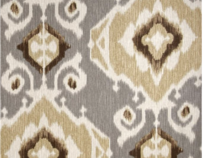
Delhi fossil cotton fabric
1. The background neutral is a mid-value grey with a violet undertone.
2. The diamond design is a mid-value beige with a yellow undertone.
3. There is a lighter beige with a pink undertone behind that one.
4. Small amounts of a dark, saturated beige/brown provide contrast and definition.
The take away for today
1. Neutrals run the gamut through
light and dark,
warm and cool,
with infinite combinations of undertone and saturation levels.
2. If we want to work with neutrals and not go bonkers,
we need to get a grip on this wild, wild gamut.
3. We can train our eyes through practice.
more practice….play with paint chips
Get a whole bunch of individual, neutral paint chips.
Thrown them down on a clear, flat surface and sort them out.
Start with the main categories
– grey
-beige
-greige
After these are sorted,
do an undertone sort for each of them–
greys…..blue, green, violet
beige….. pink, yellow, green
greige…well I don’t know about the undertones for greige,
just do your best because they could
have any of the possible undertones in them.
You don’t have to be perfect.
Just trying will open your eyes hugely.
If you get this far you’ll have a better idea than most
of what you are looking at
and maybe you’ll figure out your own system
which would be great
because there is nothing like finding your own way through a subject
to get yourself on sure footing.
So.
Now.
When you are done reading this,
and want more of the nitty gritty of undertones …
visit Maria Killam.
She offers classes, both online and in person and
you will probably learn a lot from her.
Next post will be using neutrals in interiors.
Thanks for stopping by.
Re-bop!
xo